Most loyalty program app design effort goes into screens members rarely open. This is about the one they always see.
A member opens your portal on a Tuesday night, mostly out of curiosity. He ate at one of your locations on Saturday and wants to know whether that visit got him anywhere. He logs in and lands on an account page. Profile details, a settings link, a menu with five items on it, none of which say what he came to find out. He taps one, guesses wrong, backs out, taps another. Somewhere around the third tap he finds a points balance with no context attached to it. Four hundred and twenty points and toward what, exactly? He then closes the tab.
Nothing went wrong in any way a dashboard would record. The login part had succeeded, the session counted and the data was all there but he just never got an answer to the only question he logged in to ask and he didn’t get a reason to come back this week either.
Why loyalty program app design starts with the post-login screen
Loyalty program app design puts a lot of effort into screens that only a fraction of members reach. The rewards catalogue, the activity history and the tier detail page. All of it matters and all of it is optional traffic. But post-login landing page is not optional. Every member who engages with your program passes through it every time, by definition. It is the single highest-traffic surface you own and in most portals it is also the least considered one, usually because it was never really designed. It defaults to whatever page the platform set as the landing view, which is often an account screen or a feature menu built for navigation rather than for answering anything.
That’s the gap. Members arrive with a question and the screen offers them a directory.
A member needs to know where he stands, what that standing is worth and what moves him forward. If the first screen delivers those three things before he has to tap anything, the visit reinforces the program. If he has to hunt for them, the next visit is less likely to happen. This is why loyalty program app design is better understood as a retention lever than a design project. The members who open your portal are already showing up. A home screen that gives them nothing to act on is a wasted conversation with the people most willing to have one.
What came out: the “Think about what the habit actually requires” lead-in, “the visit costs him effort and returns very little and” from the third sentence, and “your most engaged segment as they” from the fifth. The last sentence already carries the engaged-members point, so nothing is lost.
What the programs people copy actually put first
Sephora’s Beauty Insider is the loyalty program most often held up as a benchmark and the thing it gets right at the interface level is simple. Tier status and point balance are treated as primary information inside the app, not as something buried in account settings. A member can see which tier she’s in, how many points she has and what those points convert to without going looking. The structure of the program is complicated but the answer to “where do I stand” is not.
The takeaway for an F&B operator isn’t the tiering but the ordering. Status comes before browsing. Starbucks runs a different version of the same idea. Star balance sits at the top of the app’s home screen and personalised offers sit next to it. Design critiques of the app have pointed out for years that the rewards information is given the most prominent position on the page, which is a deliberate choice about what the app is for. Progress on its own is information but next to a reason to act is a prompt.
Two sentences came out. “The balance tells a member where he is and the offer gives him a reason to do something about it today rather than eventually” was saying the same thing as the closing line, just longer. And “That pairing is the part worth taking note of” was just clearing its throat before the point.
Neither company is doing anything in their loyalty program app design that requires a large product team to replicate. They decided what the first screen is for and then built it around that decision instead of around a navigation structure.
Customer Portal Homepage
Como has released a configurable Customer Portal Homepage, currently in beta, that lets merchants build the post-login landing page rather than inherit one.
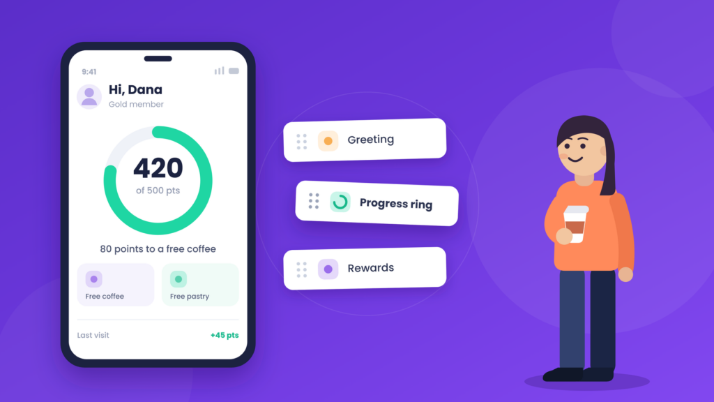
Turning on Homepage Configuration in Hub automatically makes the homepage the default landing view after login, replacing whatever feature page was previously set as the redirect. One toggle and no development work. The homepage aligns to your actual program structure, with three schemes available: points to rewards, points to tiers or visits to reward. That matters because a progress display built for a points program reads as noise to a member in a visit-based one. The layout follows the mechanic instead of forcing the mechanic into a generic layout.
The components themselves are modular and reorderable by dragging, with each one switched on or off independently:
- A greeting supports localized copy and dynamic member tags, so the screen opens with the member’s name rather than a generic welcome.
- A progress indicator renders as either a circular ring or a linear bar, with configurable point or visit thresholds, a linked reward and dynamic progress messaging. This is the answer to the question members logged in to ask and it’s the component to put at the top unless you have a strong reason not to.
- Tier benefits appear for merchants running points to tiers, showing current perks and progression toward the next tier.
- Available rewards carries a custom section header, an optional reward counter and an empty-state line with dynamic point tags, so a member with nothing to redeem still sees how far off she is rather than an empty box.
- An additional information block builds a short “How it works” guide of up to five steps with custom descriptions and an icon picker, which is useful for newer programs where members aren’t yet fluent in the earning logic.
- Recent activity shows between one and five items, with custom empty-state messaging and an optional link through to full activity.
If the Homepage is active and you later set a different feature page as the default post-login redirect, a confirmation prompt appears and accepting it switches Homepage Configuration off entirely. This is worth knowing before someone changes a redirect without realising it takes the homepage down with it.
Five things your home screen should answer in three seconds
Test your own loyalty program app design. Open your portal on a phone, log in as a member, and start a timer:
- Who am I and does this program recognise me?
- How far am I from my next reward?
- What do I have available to redeem right now?
- What did my last visit earn me?
- What should I do next?
If your current landing page answers fewer than three of those, the problem is that your most engaged members are already showing up but the screen just isn’t using them.